


Logo YouTube is one of the most recognizable brands in the world, and its logo plays a significant role in its global identity. Over the years, the YouTube logo has evolved while maintaining its core essence of simplicity and clarity. In this article, we explore the history, design, and branding impact of the YouTube logo.
History of the Logo YouTube
The YouTube logo has undergone several transformations since its launch in 2005. Below is a timeline of its key design changes:
- 2005-2011: The original YouTube logo featured the word “You” in black and “Tube” inside a red rounded rectangle, resembling a TV screen. This design symbolized YouTube’s video-centric platform.
- 2011-2013: A subtle gradient effect was added to the red play button, giving it a more modern look.
- 2013-2017: The logo received slight refinements, including a flatter design and a more vibrant red shade.
- 2017-Present: The most significant redesign moved the iconic red play button to the left of the wordmark, making it a standalone symbol of YouTube’s brand.
Design Elements of the Logo YouTube
The YouTube logo is an example of effective minimalistic branding. Here are its main design elements:
- Typography: The font used in the YouTube logo is a custom sans-serif typeface, offering a clean and modern look.
- Color Scheme: Red, white, and black are the primary colors, with red symbolizing energy, passion, and excitement.
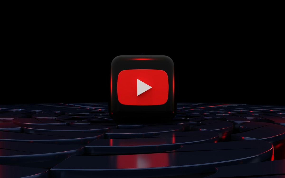
- Play Button Icon: The red play button has become an instantly recognizable symbol, representing video content and user engagement.
Branding Impact of the Logo YouTube
The YouTube logo plays a crucial role in brand recognition and audience engagement. Some key branding impacts include:
- Global Recognition: The logo is easily identifiable worldwide, making YouTube a household name.
- Versatility: The logo is designed to be adaptable across different platforms, from websites to mobile apps and smart TVs.
- User Trust: A consistent and recognizable logo builds trust and credibility among users and content creators.
Conclusion
The YouTube logo is a prime example of effective branding through simplicity and strategic design. Its evolution reflects the platform’s growth while maintaining strong brand recognition. Whether on a smartphone screen or a billboard, the YouTube logo remains a powerful symbol of digital content and global connectivity.
FAQs About the YouTube Logo
1. What does the YouTube logo represent?
The YouTube logo symbolizes the platform’s focus on video content, with the red play button representing media playback and user engagement.
2. When was the YouTube logo last updated?
The last major update to the YouTube logo occurred in 2017 when the red play button was moved to the left of the wordmark.
3. Can I use the YouTube logo for my content?
YouTube’s logo is copyrighted, and its use is subject to YouTube’s brand guidelines. Unauthorized use may lead to legal action.
4. Why is the YouTube logo red?
Red is a color associated with energy, passion, and excitement, making it an ideal choice for a dynamic platform like YouTube.
5. Has the YouTube logo always included the play button?
No, the original logo (2005-2017) featured the word “Tube” inside a red rounded rectangle. The standalone play button was introduced in 2017.